


One of the clearest ways that a hotel can stand out from the competition and wow potential guests is with a great website. But if you’re staring at a blank screen with that goal in mind, that task can suddenly seem a lot more complicated. Whether you’re designing a new hotel website or trying to give yours a refresh, a little inspiration can go a long way towards making some meaningful progress. Below, we take a look at some refreshing examples of the best hotel website design from across the globe. We also cover the key things you need to make your own hotel website stand out.
While every hotel website design is unique, there are a few necessities that will put your website a cut above the rest:
- Copy and media that showcase your benefits. Show off your value proposition for guests with high-quality images and video, clear messaging, and engaging content.
- Clear navigation. Make it easy for guests to find the information they need related to room booking, amenities, events, etc.
- Strategic white space. Empty space helps guide the eyes of your reader to what’s important, while keeping the page from becoming overwhelming or cluttered.
- Contact information. Consider live chat, hotel chatbots, or a texting function to help those with questions get quick answers.
- Great technical SEO. Fast page loads, compressed images, search-engine optimized text, and site security all help your site be found by more people.
- Accessibility. Ensure that those with limited vision, hearing, or other accessibility needs can easily get the information they’re seeking.
- Responsive design. Your design should easily accommodate a variety of screen sizes and devices, including a fully-optimized mobile experience
- A streamlined checkout process. Reduce unnecessary steps in your conversion process so that visitors can quickly and easily accomplish their task.
If you’ve got all of those necessities covered, you’re already doing a great job. For some extra inspiration to impress your hotel website's visitors, check out the 7 examples below.
Let us help you take your hotel's online presence to unprecedented heights
Explore 7 examples of the best hotel website design:
1. Kimpton
Kimpton is a brand known for boutique hotels, with each one having its own unique personality. The main Kimpton website does a great job of highlighting the uniqueness of each property while staying true to the brand.
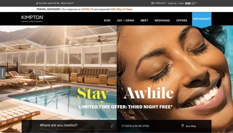
With the right images on your website, your target audience will feel welcomed and will be more likely to choose your hotel because it matches their desires. Kimpton’s main page has an editorial feel, with high-quality imagery that targets a design-focused crowd, and a clear search box for their above-the-fold call to action (CTA). The blue “check availability” button stands out from the rest of the design while still working with the overall look and feel of the site. The navigation is clean and simple, with everything located within easy reach.

Moving further down the page, Kimpton has found a way to highlight their commitment to cleanliness with an on-brand message. They also showcase their creative approach to weddings and other events, which is a great way to welcome guests back when the time is right.

With a lot of very different properties under their brand umbrella, Kimpton has found a great way to help guests find the right location for their needs. The “search by experience” section breaks properties up into mountain destinations, family destinations, spa destinations, urban destinations, and more. This shows a great focus on the customer and how they want to search for properties.
Explore our extensive suite of hotel website solutions today
2. Basecamp Hotel
The Basecamp Hotel in Lake Tahoe, California is a boutique hotel with a camping vibe, complete with outdoor S’mores fire pits, trail maps, and even an indoor camping tent. The website for the hotel plays up this theme and increases guest anticipation for an exciting trip.
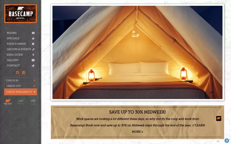
It’s important to create a website experience that reflects the branding and feel of your property so that your target audience can begin getting excited about their hotel experience. The website for the Basecamp hotel perfectly matches their overall brand aesthetic, with a simple no-frills approach and organic feel. The hero image on the main page shows off their Instagram-envy inspiring camping tent suite, which features a glamping style tent in a spacious indoor hotel room. The trail map background and wrinkled paper textures throughout the site increase the feeling of a camping excursion.

Additionally, Basecamp uses a free plugin, Enable, to offer changes to how their website looks based on a user’s accessibility needs. Guests can change the site to monochrome coloring, invert the colors, highlight links, or increase the font size to suit their needs. This is a great way of showing that Basecamp cares about all of their guests while also improving the user experience.
3. Ace Hotel
When guests visit a location, many of them want to feel like they are soaking up the charm and unique qualities of that locale. The Ace Hotel in Portland Oregon does a great job of showcasing the feel of Portland within its hotel website design, so that guests can get a good idea of what to expect from their stay.
The site uses a unique 4-sided navigation system to frame imagery of the hotel, keeping the look of the site simple and clean but including a lot of information. It's particularly interesting to see the link to their loyalty program on the right, with the copy “Join the A-list.” This is a nice touch to make loyal guests feel like they are part of an exclusive club.
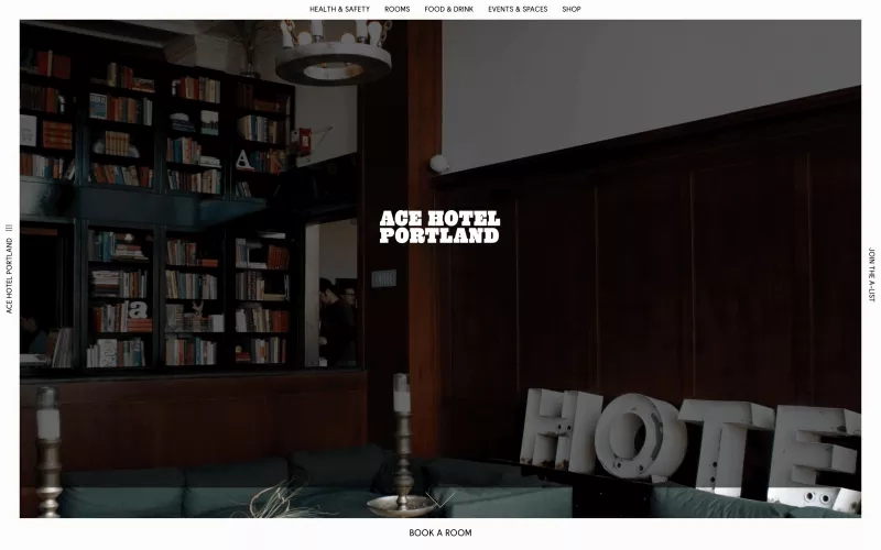
One note of caution: If your navigation is at all out of the ordinary, you’ll want to test it with guests to make sure they can use the site easily and find the information they need. A nice-looking design should never take precedence over the guest experience on your site.
4. Exclusive Collection
Exclusive Collection — a family-owned, independent collection of properties in the United Kingdom — puts the focus on guests and what they need on every page, including images and summaries for each property on the main website. This helps guests who are exploring and researching which location will suit their needs.
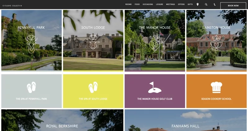
The hotel images show off the style of each property, while helpful icons give guests an idea of which amenities they can expect from the property. Hovering over the property reveals a short description of the property, and clicking the image takes the guest to that location’s website. The navigation and ease-of-use feel seamless and customer-centric.
5. Burj Al Arab
The Burj Al Arab in Dubai is an icon of the city’s skyline, with unmistakable architectural features and stylish opulence. The hotel’s website design matches this feel of elegance with sweeping views of the property, plush imagery, and landing-page copy that evokes a sense of luxury.

If your property has a particularly impressive location, aerial footage from a drone is a great way to show it off. The Burj Al Arab does just that, using footage that circles the property, giving a wonderful glimpse of the building’s stunning location and its place within the larger skyline of Dubai.
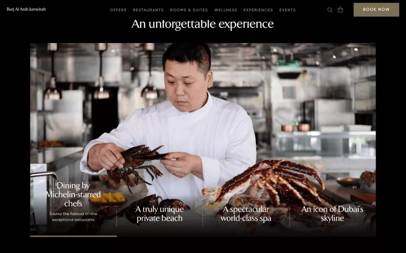
The site also uses a visually-appealing gallery of images representing each of their unique selling points for visitors, including their Michelin-star dining, private beach, spa, and architecture. Listing the selling points as text over the images gives guests a glimpse into other pieces of value even as they’re looking at the current image, and the navigation is very clear.
6. Hotel d’Angleterre
This example displays the simple luxury of a boutique hotel in Geneva, Switzerland. The Hotel d’Angleterre uses full-width images to display the elegant furnishings and setting of the hotel. Also, the booking form is front and center so that visitors can immediately check availability.
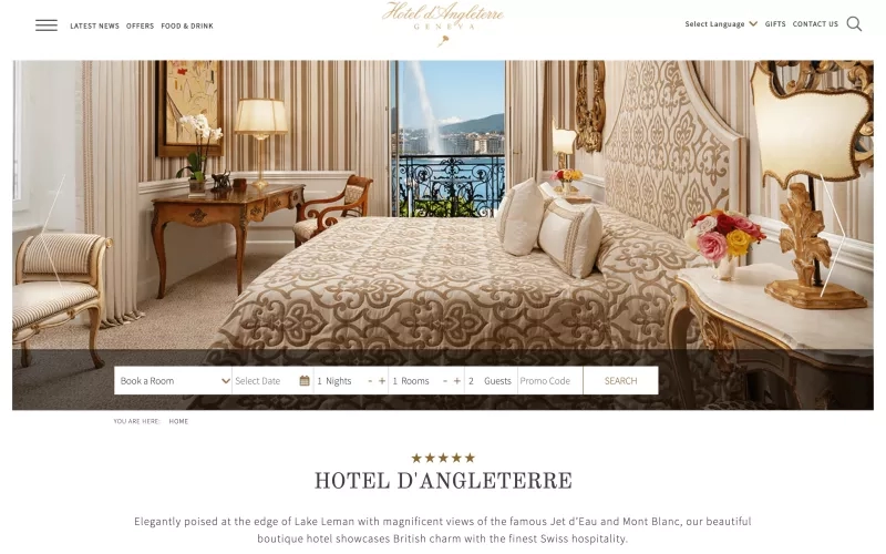
All of the warm tones in the slideshow images complement the warm golden hotel logo, and many of the images reflect the curling script with their own flowing curves. The website uses white space strategically to guide the visitor’s eye towards the name of the hotel and its five-star rating.

For a certain target audience, the images guests capture and share on social media will be almost as important as their stay at the hotel. The Hotel d’Angleterre website highlights stunning images shared by guests on social media in an Instagram-friendly grid, while also inviting visitors to connect with the hotel on its social media channels. This provides guests a way to anticipate their stay, share their great experience, and convince others to book a stay at the hotel.
Rather than setting up a social media feed on your site and calling it a day, consider curating images that reflect your brand and the goals for your website. You don’t want to be caught off guard when a guest shares an image of their half-eaten room service pizza.
7. Refinery Hotel
Video content is a growing trend on hotel websites, and with good reason. The movement of video catches the eyes of website visitors and draws their attention towards the content being displayed. But if not done well, video content can be distracting, off-brand, or overwhelming for visitors that just want information.
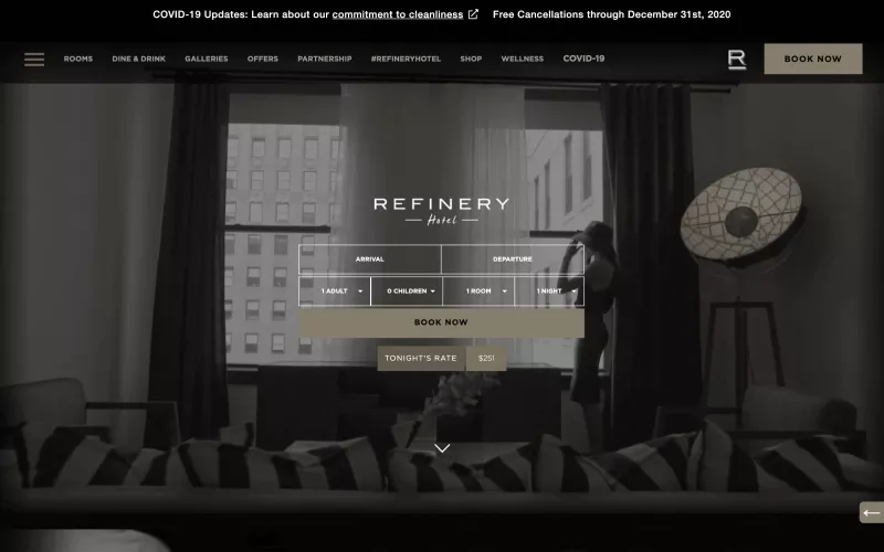
The Refinery Hotel in New York City does a great job of using video content in an effective way. The video serves as a subtle backdrop for the booking search form, with minimal movement and action to distract the viewer. The muted tones of the video go well with the overall look of the site, and put all of the focus on the call-to-action. This focus stays throughout the site, as the booking form sticks to the top of the screen once a user begins scrolling.
If you do choose to use video on your site, make sure that it's subtle and supports your goals for the viewer. If the colors in the video are distracting, consider adding a semi-transparent overlay in a brand color. This will tie the look together with the rest of the site and allow the visitor to focus on any messaging you put on top of the video.
Use these examples of the best hotel website design as inspiration!
Ready to show off your hotel’s stylish new website to potential guests? Check out venue marketing ideas to get the word out and bring new visitors to your site.


